Data Summary

Comprehensive analysis of the Our World in Data CO₂ dataset with exploratory visualizations, code, and detailed explanations.

Data Summary — CO₂ & Greenhouse Gas Emissions Dataset

Source: Our World in Data (OWID) — Global CO₂ and Greenhouse Gas Emissions
File: owid-co2-data.csv
Period: 1750–2024 (275 years of observations)


1. Dataset Dimensions & Structure

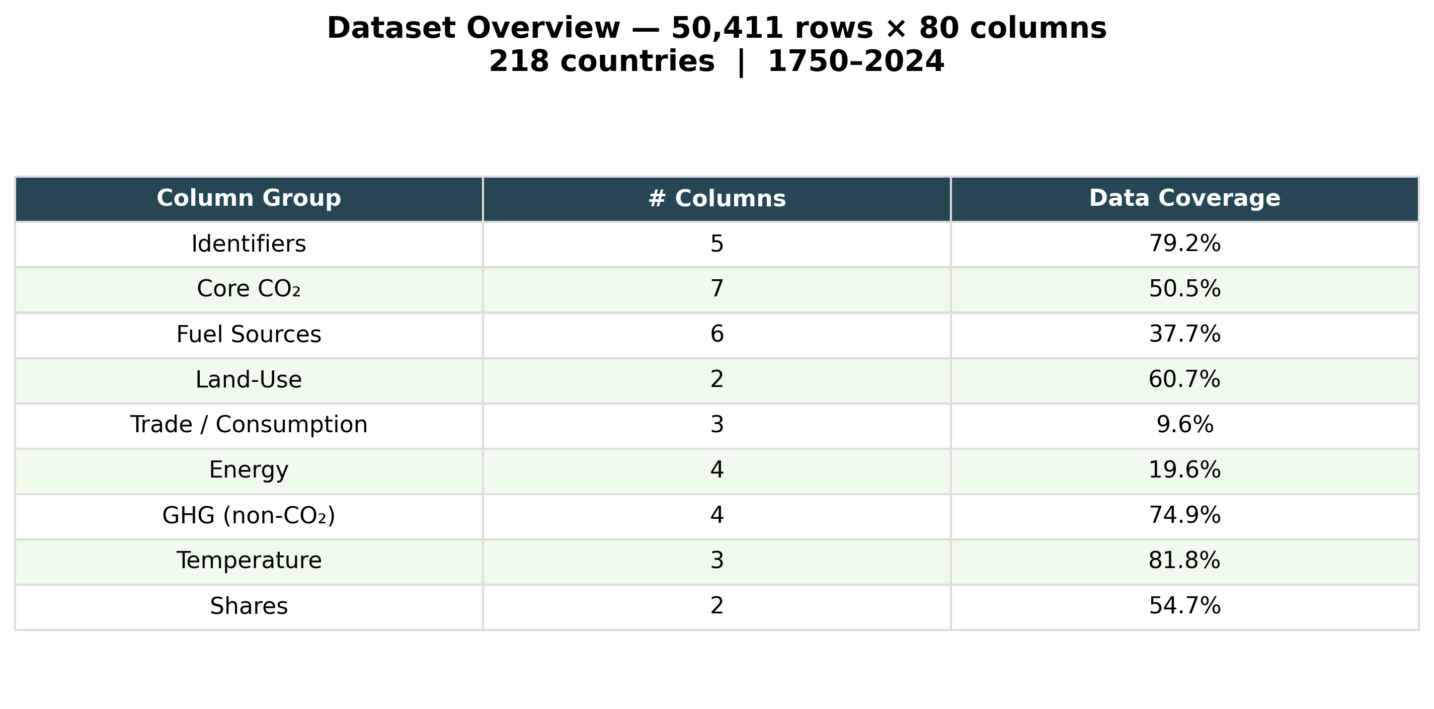
The dataset contains 50,411 observations across 80 columns, covering 218 countries and territories from 1750 to 2024. Each row represents a single country-year observation.

Dataset Overview

The 80 columns are organised into nine thematic groups:

Group Representative Columns Purpose
Identifiers country, year, iso_code, population, gdp Row identification and socio-economic context
Core CO₂ co2, co2_per_capita, co2_per_gdp, cumulative_co2 Total and normalised fossil-fuel CO₂ emissions
Fuel Sources coal_co2, oil_co2, gas_co2, cement_co2, flaring_co2 Emissions disaggregated by combustion source
Land-Use land_use_change_co2, co2_including_luc Deforestation and land-conversion emissions
Trade / Consumption consumption_co2, trade_co2, trade_co2_share Consumption-based accounting and embedded trade emissions
Energy primary_energy_consumption, co2_per_unit_energy Energy system scale and carbon intensity
GHG (non-CO₂) total_ghg, methane, nitrous_oxide, ghg_per_capita Full greenhouse gas accounting including CH₄ and N₂O
Temperature temperature_change_from_co2, share_of_temperature_change_from_ghg Attribution of observed warming to individual countries
Shares share_global_co2, share_global_cumulative_co2 Each country’s fraction of global totals

Loading and Initial Exploration

View Code
import warnings
warnings.filterwarnings("ignore")

import pandas as pd
import numpy as np
import matplotlib.pyplot as plt
import matplotlib.ticker as mticker
import seaborn as sns
from sklearn.manifold import TSNE
from sklearn.preprocessing import StandardScaler
from pathlib import Path

df = pd.read_csv("./owid-co2-data.csv", low_memory=False)
if "gdp_per_capita" not in df.columns:
    df["gdp_per_capita"] = df["gdp"] / df["population"]

country_df = df[df["iso_code"].notna() & (df["iso_code"] != "")].copy()
world_df   = df[df["country"] == "World"].copy()

print(f"Full dataset   : {df.shape[0]:,} rows × {df.shape[1]} columns")
print(f"Country rows   : {country_df.shape[0]:,} rows | {country_df['country'].nunique()} countries")
print(f"Year range     : {df['year'].min()}{df['year'].max()}")
Full dataset   : 50,411 rows × 80 columns
Country rows   : 42,480 rows | 218 countries
Year range     : 1750 – 2024

2. Data Coverage & Missingness

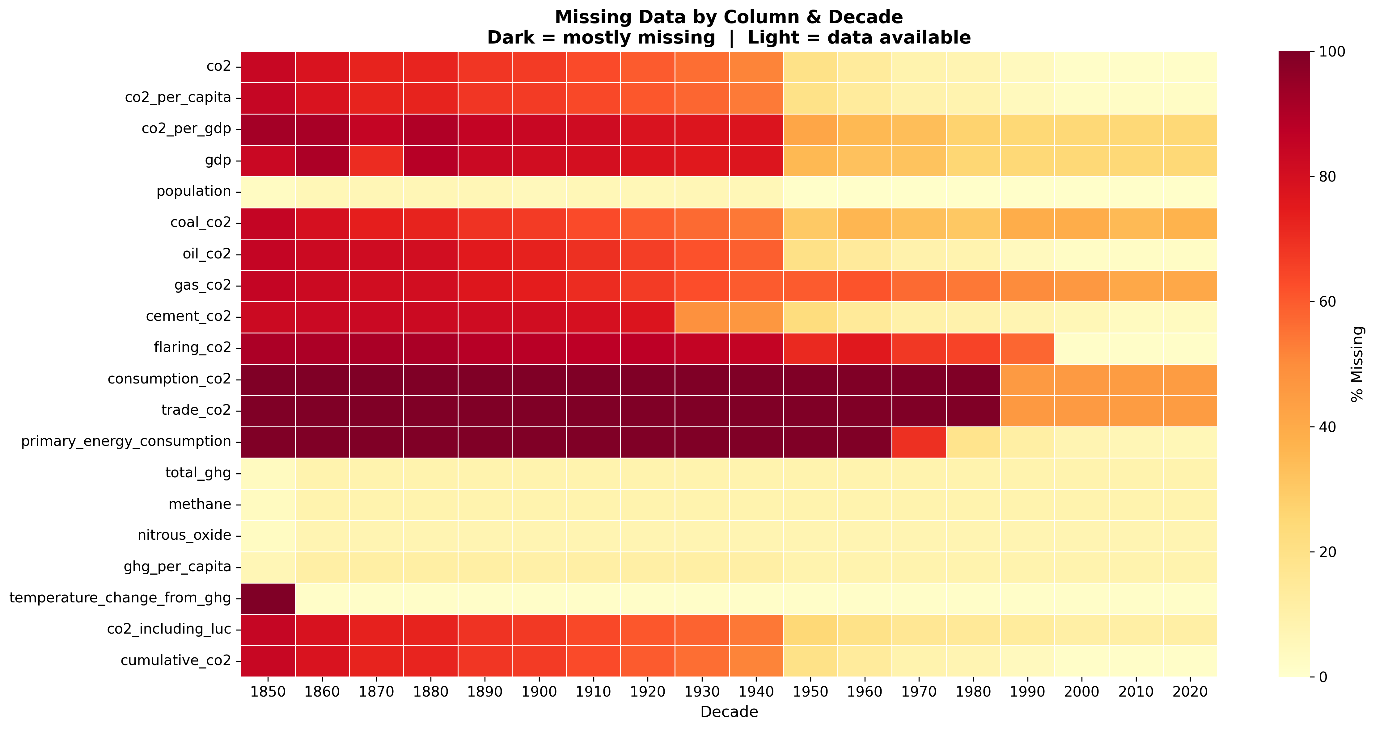
Data availability varies substantially across columns and time periods. Core emissions data (co2, population) is available from the mid-1800s onward, while trade, GHG, and temperature attribution data only becomes available from the 1990s.

Missing Data Heatmap

Key observations on data availability: - co2 and population have near-complete coverage from 1850 onwards.
- Fuel-source breakdown (coal, oil, gas) becomes available from approximately 1900.
- Trade and consumption-based CO₂ data is only available from ~1990, and only for countries with detailed economic reporting.
- GHG, methane, and nitrous oxide data begins around 1990, sourced from the Jones et al. national contributions dataset.
- Temperature attribution metrics are the most sparse — available only for selected years and countries with sufficient historical emission records.

This missingness pattern is not random; it reflects the historical development of measurement infrastructure. Pre-1950 data relies heavily on historical reconstructions, while post-1990 data benefits from satellite observations and standardised national reporting under the UNFCCC.

Code for Missing Data Analysis

View Code
plt.rcParams.update({
    "font.family":       "DejaVu Sans",
    "font.size":         11,
    "axes.titlesize":    14,
    "axes.titleweight":  "bold",
    "axes.labelsize":    12,
    "axes.spines.top":   False,
    "axes.spines.right": False,
    "figure.dpi":        120,
    "savefig.dpi":       300,
    "savefig.bbox":      "tight",
    "savefig.facecolor": "white",
})

OUT = Path("../Plots/DataSummary")
OUT.mkdir(parents=True, exist_ok=True)

key_cols = [
    "co2", "co2_per_capita", "co2_per_gdp", "gdp", "population",
    "coal_co2", "oil_co2", "gas_co2", "cement_co2", "flaring_co2",
    "consumption_co2", "trade_co2", "primary_energy_consumption",
    "total_ghg", "methane", "nitrous_oxide", "ghg_per_capita",
    "temperature_change_from_ghg", "co2_including_luc", "cumulative_co2",
]
key_cols = [c for c in key_cols if c in df.columns]

decades = list(range(1850, 2030, 10))
miss_data = []
for yr in decades:
    row_yr = country_df[country_df["year"] == yr]
    if row_yr.empty:
        miss_data.append([100.0] * len(key_cols))
    else:
        miss_data.append([(row_yr[c].isna().sum() / len(row_yr)) * 100 for c in key_cols])

miss_df = pd.DataFrame(miss_data, index=decades, columns=key_cols)

fig, ax = plt.subplots(figsize=(16, 8))
sns.heatmap(miss_df.T, cmap="YlOrRd", annot=False, linewidths=0.3,
            linecolor="white", cbar_kws={"label": "% Missing"}, ax=ax,
            vmin=0, vmax=100)
ax.set_title("Missing Data by Column & Decade\n"
             "Dark = mostly missing  |  Light = data available",
             fontsize=14, fontweight="bold")
ax.set_xlabel("Decade"); ax.set_ylabel("")
ax.tick_params(axis="y", rotation=0)
plt.tight_layout()
plt.savefig(OUT / "DS2_missing_data_heatmap.png")
plt.close()

3. Distribution of Key Variables

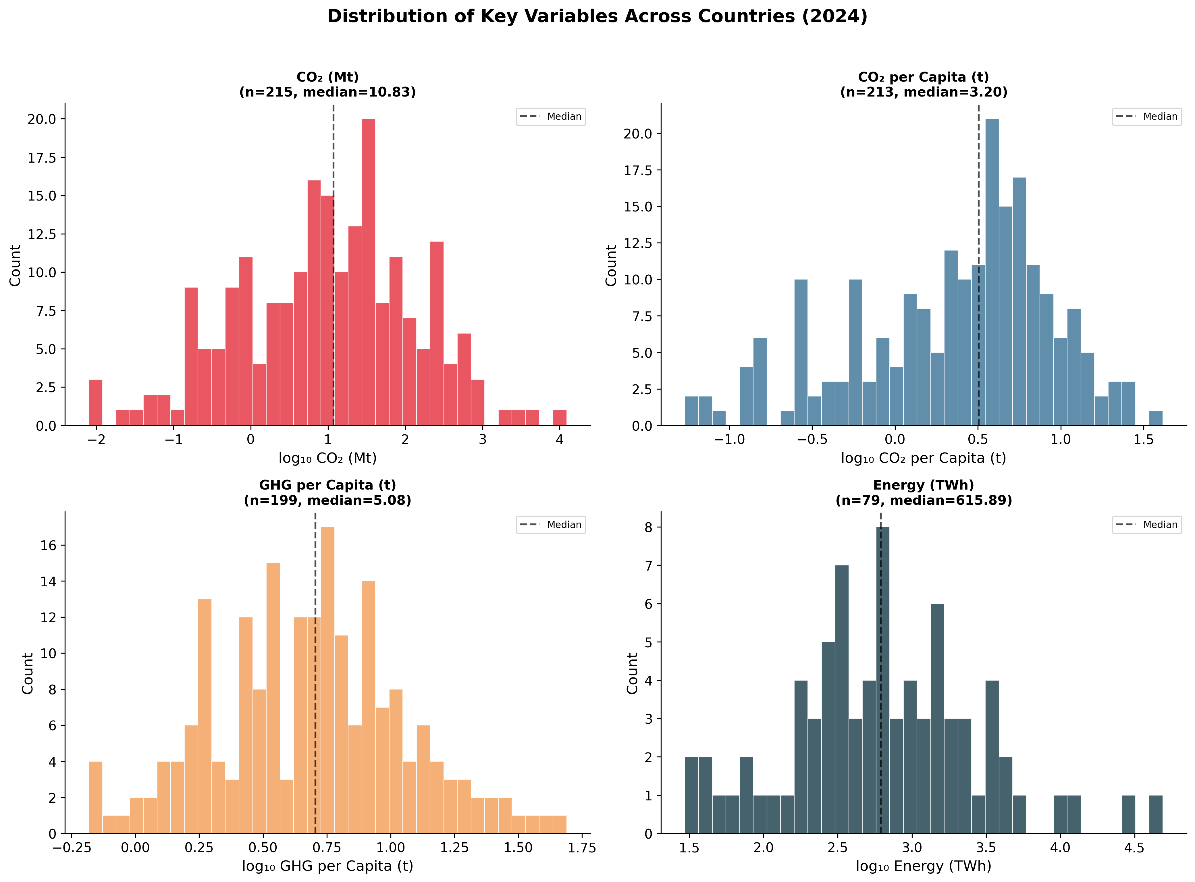
The distributions of core variables across all countries in the most recent year reveal heavy right-skewness — a small number of countries dominate global emissions while the majority contribute very little.

Distribution Histograms

Key distributional findings:

  • CO₂ emissions (Mt): Extremely right-skewed. China (~12,000 Mt) and the United States (~4,800 Mt) are extreme outliers; the median country emits under 20 Mt. A log-scale transformation is necessary for meaningful cross-country comparison.

  • CO₂ per capita (tonnes/person): Less skewed than absolute emissions (due to normalisation), but still ranges from under 0.1 t in Sub-Saharan Africa to over 30 t in Gulf states. The global median is approximately 3–4 tonnes per person.

  • GHG per capita: Includes methane and nitrous oxide in addition to CO₂, enlarging the footprint of agriculture-heavy economies (e.g., Brazil, Argentina, Australia) relative to their CO₂-only figures.

  • Primary energy consumption (TWh): Again dominated by China and the US, with the vast majority of countries consuming under 500 TWh.

Code for Distribution Analysis

View Code
latest = country_df["year"].max()
df_latest = country_df[country_df["year"] == latest].copy()

dist_cols   = ["co2", "co2_per_capita", "ghg_per_capita", "primary_energy_consumption"]
dist_labels = ["CO₂ (Mt)", "CO₂ per Capita (t)", "GHG per Capita (t)", "Energy (TWh)"]
dist_colors = ["#E63946", "#457B9D", "#F4A261", "#264653"]

fig, axes = plt.subplots(2, 2, figsize=(14, 10))
fig.suptitle(f"Distribution of Key Variables Across Countries ({latest})",
             fontsize=15, fontweight="bold", y=1.02)

for ax, col, label, colour in zip(axes.flat, dist_cols, dist_labels, dist_colors):
    data = df_latest[col].dropna()
    if data.empty:
        ax.text(0.5, 0.5, "No data", ha="center", va="center", transform=ax.transAxes)
        ax.set_title(label); continue
    # Use log scale if highly skewed
    skew = data.skew()
    plot_data = np.log10(data[data > 0]) if abs(skew) > 2 else data
    ax.hist(plot_data, bins=35, color=colour, alpha=0.85, edgecolor="white", linewidth=0.5)
    ax.set_xlabel(f"{'log₁₀ ' if abs(skew) > 2 else ''}{label}")
    ax.set_ylabel("Count")
    ax.set_title(f"{label}\n(n={len(data)}, median={data.median():.2f})", fontsize=11)
    ax.axvline(plot_data.median(), color="black", linewidth=1.5, linestyle="--", alpha=0.7,
               label=f"Median")
    ax.legend(fontsize=8)

plt.tight_layout()
plt.savefig(OUT / "DS3_distributions.png")
plt.close()

4. Correlation Structure

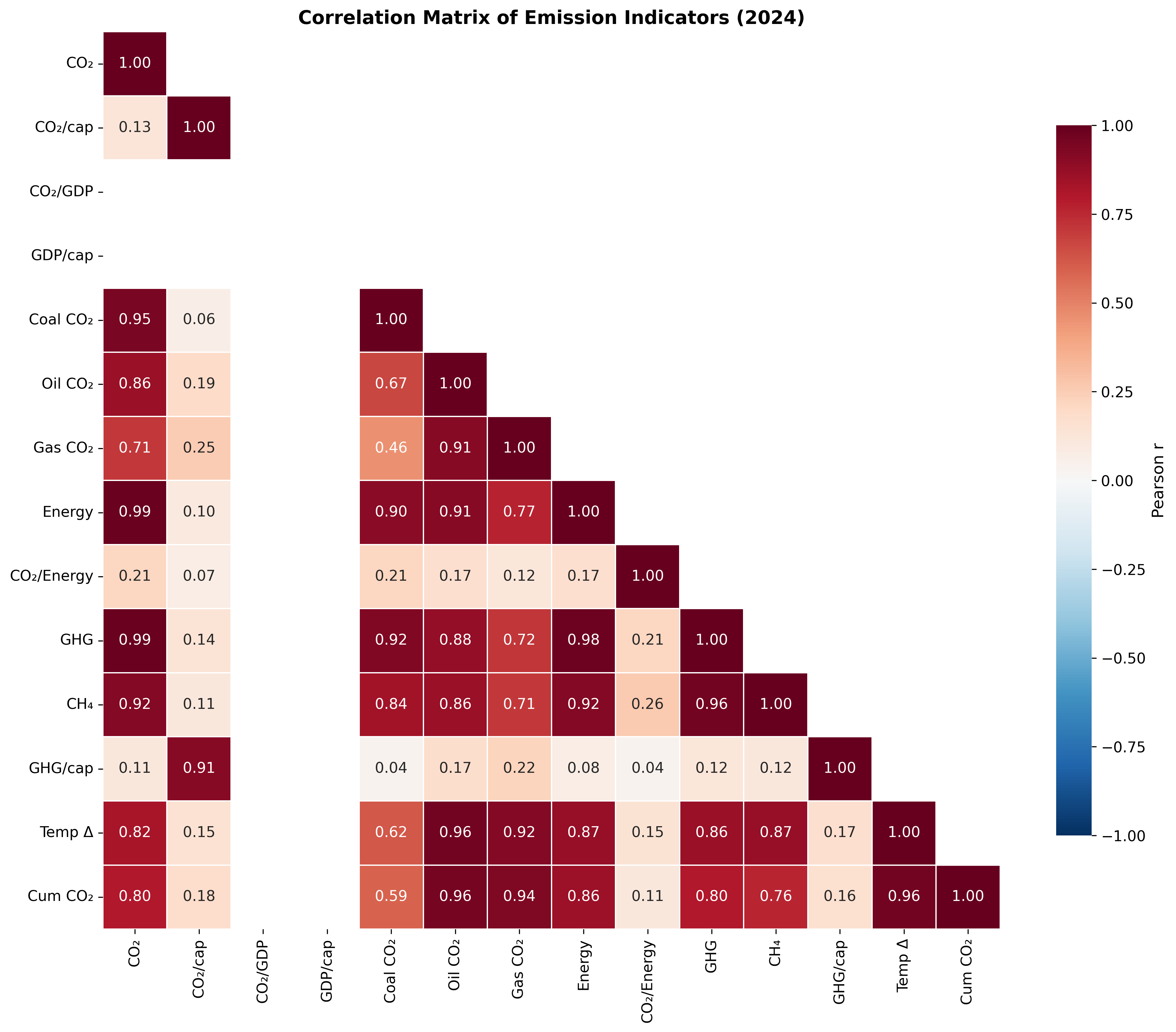
The correlation heatmap reveals the relationships among 14 emission and economic indicators.

Correlation Heatmap

Major correlations observed:

  • CO₂ and energy consumption are very strongly correlated (r ≈ 0.99) — confirming that fossil-fuel combustion for energy is the primary source of CO₂ emissions globally.

  • Total GHG and CO₂ correlate strongly (r > 0.95), but not perfectly. The gap is filled by methane and nitrous oxide, which are partially independent of the fossil fuel system (originating in agriculture and land use).

  • CO₂ per capita and GDP per capita show moderate positive correlation (r ≈ 0.50–0.65), consistent with observations: wealthier countries emit more per person, but with significant scatter due to policy and energy-mix differences.

  • CO₂ per GDP (carbon intensity) is weakly or negatively correlated with GDP per capita, indicating that richer countries tend to produce economic output more efficiently in carbon terms.

  • Cumulative CO₂ and temperature attribution are near-perfectly correlated — confirming that countries that have emitted the most historically are responsible for the most warming.

Code for Correlation Analysis

View Code
corr_cols = [
    "co2", "co2_per_capita", "co2_per_gdp", "gdp_per_capita",
    "coal_co2", "oil_co2", "gas_co2",
    "primary_energy_consumption", "co2_per_unit_energy",
    "total_ghg", "methane", "ghg_per_capita",
    "temperature_change_from_ghg", "cumulative_co2",
]
corr_cols = [c for c in corr_cols if c in df_latest.columns]

corr_matrix = df_latest[corr_cols].corr()

# Pretty labels
pretty = {
    "co2": "CO₂", "co2_per_capita": "CO₂/cap", "co2_per_gdp": "CO₂/GDP",
    "gdp_per_capita": "GDP/cap", "coal_co2": "Coal CO₂", "oil_co2": "Oil CO₂",
    "gas_co2": "Gas CO₂", "primary_energy_consumption": "Energy",
    "co2_per_unit_energy": "CO₂/Energy", "total_ghg": "GHG",
    "methane": "CH₄", "ghg_per_capita": "GHG/cap",
    "temperature_change_from_ghg": "Temp Δ", "cumulative_co2": "Cum CO₂",
}
corr_matrix.index   = [pretty.get(c, c) for c in corr_matrix.index]
corr_matrix.columns = [pretty.get(c, c) for c in corr_matrix.columns]

mask = np.triu(np.ones_like(corr_matrix, dtype=bool), k=1)

fig, ax = plt.subplots(figsize=(13, 11))
sns.heatmap(corr_matrix, mask=mask, annot=True, fmt=".2f",
            cmap="RdBu_r", center=0, linewidths=0.5, linecolor="white",
            square=True, cbar_kws={"shrink": 0.75, "label": "Pearson r"},
            ax=ax, vmin=-1, vmax=1)
ax.set_title(f"Correlation Matrix of Emission Indicators ({latest})",
             fontsize=14, fontweight="bold")
plt.tight_layout()
plt.savefig(OUT / "DS4_correlation_heatmap.png")
plt.close()

5. Country Clustering by Emission Profile (t-SNE)

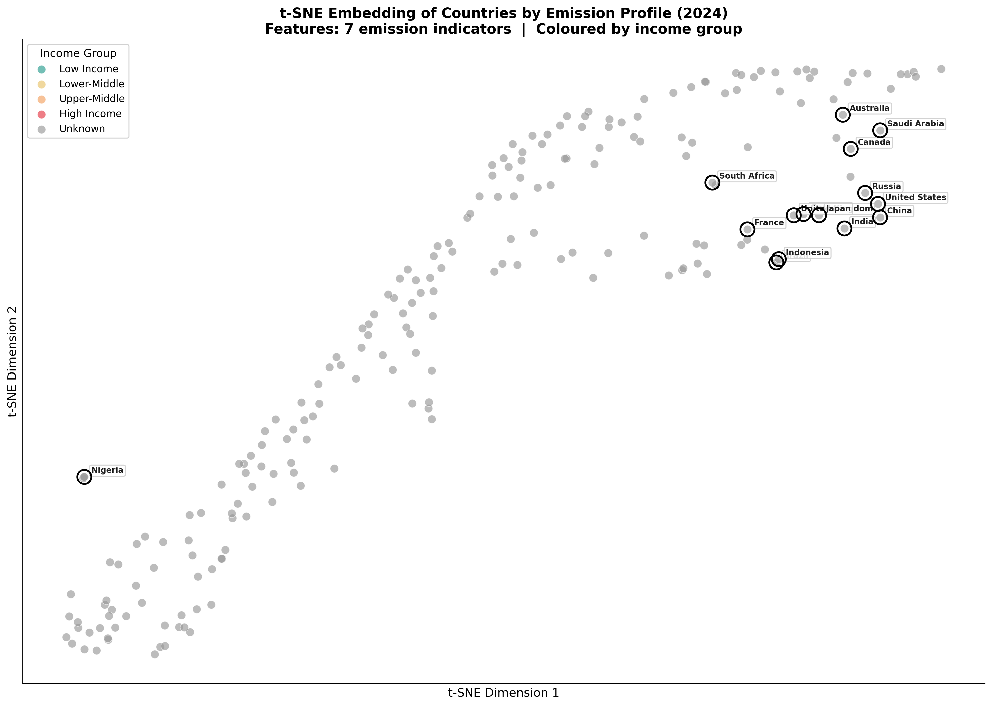
To visualise how countries group by multi-dimensional emission characteristics, a t-SNE embedding was computed using 7 features: CO₂ per capita, CO₂ per GDP, coal/oil/gas emissions, cumulative CO₂, and share of global CO₂. Countries are coloured by income group (GDP per capita quartiles).

t-SNE Embedding

Cluster interpretation:

  • High-income, high-emission cluster (upper-right region): The United States, Canada, Australia, and Gulf states cluster together — these are wealthy nations with high per-capita emissions driven by fossil-fuel dependence and car-centric urban design.

  • Industrial giants, isolated: China and India appear as outliers, distant from both the high-income cluster and the low-income group. Their emission profiles are dominated by sheer scale (coal-driven industry) rather than per-capita intensity, giving them a unique position in the embedding.

  • European decouplers: Germany, United Kingdom, France, and Japan form a distinct sub-cluster — high income but moderate-to-low per-capita emissions, reflecting successful energy transition and deindustrialisation.

  • Low-income, low-emission cluster (left region): Sub-Saharan African and South Asian countries cluster tightly together — uniformly low emissions across all metrics. These countries contribute minimally to global emissions and warming.

  • Resource exporters: Russia and Saudi Arabia sit between clusters — their emission profiles are shaped by fossil-fuel extraction rather than typical industrial or consumption patterns.

The t-SNE visualisation confirms that emission profiles are not simply a function of income. Countries with similar GDP per capita can occupy very different positions in the embedding depending on their energy mix, industrial structure, and policy trajectory.

Code for t-SNE Analysis

View Code
# Use a compact feature set with high data coverage
tsne_cols = [
    "co2_per_capita", "co2_per_gdp", "coal_co2", "oil_co2", "gas_co2",
    "cumulative_co2", "share_global_co2",
]
tsne_cols = [c for c in tsne_cols if c in df_latest.columns]

df_tsne = df_latest[["country"] + tsne_cols].copy()
df_tsne = df_tsne.replace([np.inf, -np.inf], np.nan)

# Require at least co2_per_capita to be present
df_tsne = df_tsne.dropna(subset=["co2_per_capita"]).reset_index(drop=True)

# Fill remaining NaN with column median (so we don't lose countries)
for c in tsne_cols:
    med = df_tsne[c].median()
    df_tsne[c] = df_tsne[c].fillna(med if pd.notna(med) else 0)

print(f"t-SNE using {len(df_tsne)} countries × {len(tsne_cols)} features")

X = df_tsne[tsne_cols].values.astype(np.float64)
scaler = StandardScaler()
X_scaled = scaler.fit_transform(X)

# Assign income groups by GDP per capita quartiles
gdp_vals = df_latest.set_index("country")["gdp_per_capita"]
df_tsne["gdp_pc"] = df_tsne["country"].map(gdp_vals)
q25, q50, q75 = df_tsne["gdp_pc"].quantile([0.25, 0.50, 0.75])

def income_group(g):
    if pd.isna(g): return "Unknown"
    if g < q25: return "Low Income"
    if g < q50: return "Lower-Middle"
    if g < q75: return "Upper-Middle"
    return "High Income"

df_tsne["income_group"] = df_tsne["gdp_pc"].apply(income_group)

# Run t-SNE
perplexity = min(30, len(df_tsne) - 1)
tsne = TSNE(n_components=2, perplexity=perplexity, random_state=42,
            learning_rate="auto", init="pca", max_iter=1500)
embedding = tsne.fit_transform(X_scaled)
df_tsne["x"] = embedding[:, 0]
df_tsne["y"] = embedding[:, 1]

# Plot
group_colours = {
    "Low Income":    "#2A9D8F",
    "Lower-Middle":  "#E9C46A",
    "Upper-Middle":  "#F4A261",
    "High Income":   "#E63946",
    "Unknown":       "#999999",
}

highlight = [
    "United States", "China", "India", "Brazil", "Russia", "Germany",
    "United Kingdom", "Japan", "Saudi Arabia", "South Africa",
    "Nigeria", "Australia", "France", "Indonesia", "Canada",
]

fig, ax = plt.subplots(figsize=(14, 10))

for grp, colour in group_colours.items():
    mask = df_tsne["income_group"] == grp
    ax.scatter(df_tsne.loc[mask, "x"], df_tsne.loc[mask, "y"],
               c=colour, s=70, alpha=0.65, edgecolors="white",
               linewidths=0.5, label=grp, zorder=3)

# Highlight and label major countries
for country in highlight:
    row = df_tsne[df_tsne["country"] == country]
    if row.empty: continue
    ax.scatter(row["x"], row["y"], s=200, facecolors="none",
               edgecolors="black", linewidths=1.8, zorder=5)
    ax.annotate(country, (row["x"].values[0], row["y"].values[0]),
                xytext=(7, 4), textcoords="offset points",
                fontsize=8, fontweight="bold", color="#222222",
                bbox=dict(boxstyle="round,pad=0.2", fc="white", ec="#CCCCCC", alpha=0.85))

ax.set_xlabel("t-SNE Dimension 1", fontsize=12)
ax.set_ylabel("t-SNE Dimension 2", fontsize=12)
ax.set_title(
    f"t-SNE Embedding of Countries by Emission Profile ({latest})\n"
    f"Features: {len(tsne_cols)} emission indicators  |  Coloured by income group",
    fontsize=14, fontweight="bold",
)
ax.legend(title="Income Group", fontsize=10, title_fontsize=11,
          loc="upper left", framealpha=0.9)

# Remove axis ticks (t-SNE units are not meaningful)
ax.set_xticks([]); ax.set_yticks([])

plt.tight_layout()
plt.savefig(OUT / "DS5_tsne_country_clusters.png")
plt.close()
t-SNE using 213 countries × 7 features

6. Global Emissions Timeline

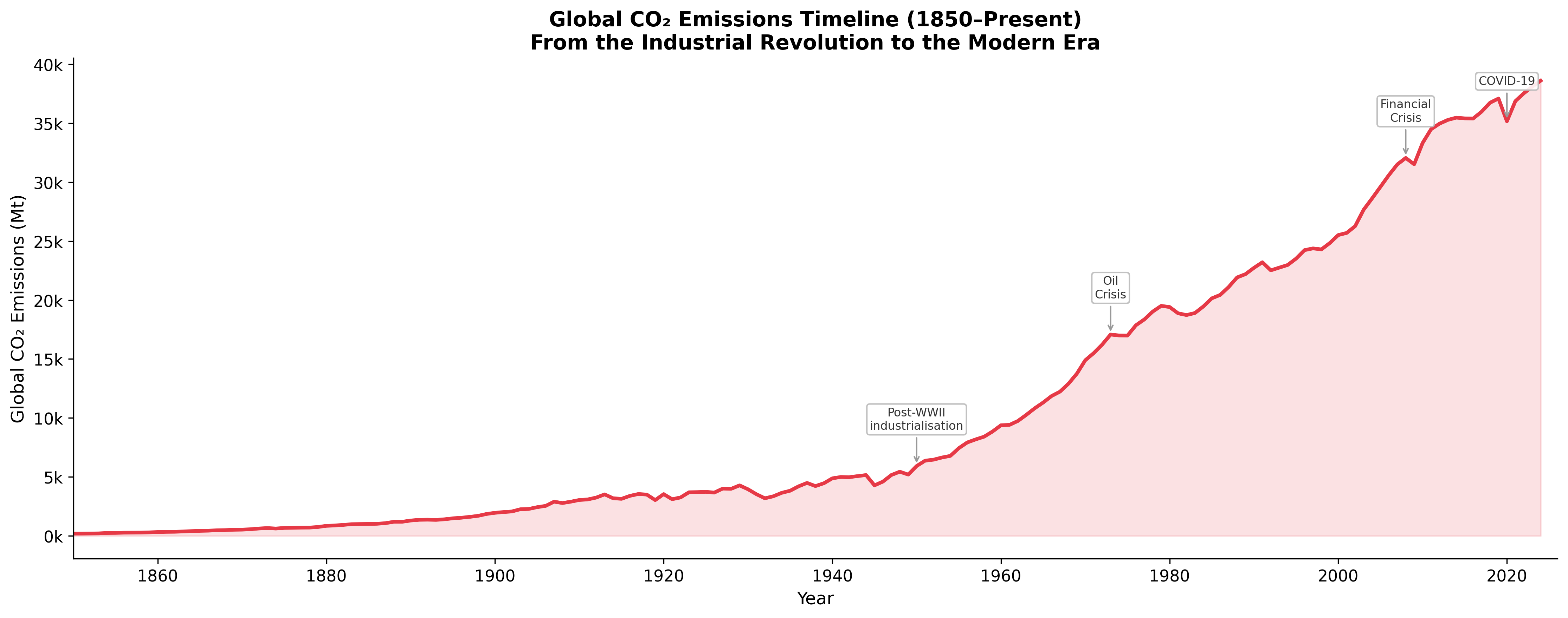
The long-run trajectory of global CO₂ emissions provides essential context for all subsequent analysis.

Global Timeline
  • Pre-1950: Emissions grew slowly, driven by coal-powered industrialisation in Europe and North America. By 1950, global emissions were approximately 6,000 Mt.

  • 1950–1973 (The Great Acceleration): Post-WWII industrial expansion, suburbanisation, and the rise of the automobile drove exponential growth. Emissions roughly tripled in this period.

  • 1973–2000: Growth slowed after the oil crises, but never reversed. Emissions continued climbing as developing nations industrialised.

  • 2000–2019: The most rapid absolute growth in history, driven primarily by China’s industrial surge. Global emissions rose from ~25,000 Mt to ~37,000 Mt.

  • 2020 (COVID-19): A sharp but temporary ~5% decline due to pandemic lockdowns. Emissions rebounded fully by 2021–2022.

  • 2022–2024: Emissions have plateaued near historical highs (~38,000–39,000 Mt), with modest annual growth as renewable energy expansion begins to offset some fossil-fuel growth.

Code for Global Timeline

View Code
world_ts = world_df[["year", "co2"]].dropna()
world_ts = world_ts[world_ts["year"] >= 1850].copy()

fig, ax = plt.subplots(figsize=(15, 6))
ax.fill_between(world_ts["year"], world_ts["co2"], alpha=0.15, color="#E63946")
ax.plot(world_ts["year"], world_ts["co2"], color="#E63946", linewidth=2.5)

# Annotate key milestones
markers = {1950: "Post-WWII\nindustrialisation", 1973: "Oil\nCrisis",
           2008: "Financial\nCrisis", 2020: "COVID-19"}
for yr, label in markers.items():
    val = world_ts[world_ts["year"] == yr]["co2"]
    if val.empty: continue
    ax.annotate(label, (yr, val.values[0]),
                xytext=(0, 25), textcoords="offset points", ha="center",
                fontsize=8, color="#333333",
                arrowprops=dict(arrowstyle="->", color="#999999"),
                bbox=dict(boxstyle="round,pad=0.25", fc="white", ec="#BBBBBB", alpha=0.9))

ax.set_xlabel("Year")
ax.set_ylabel("Global CO₂ Emissions (Mt)")
ax.set_title("Global CO₂ Emissions Timeline (1850–Present)\n"
             "From the Industrial Revolution to the Modern Era",
             fontsize=14, fontweight="bold")
ax.yaxis.set_major_formatter(mticker.FuncFormatter(lambda x, _: f"{x/1000:.0f}k"))
ax.set_xlim(1850, world_ts["year"].max() + 2)

plt.tight_layout()
plt.savefig(OUT / "DS6_global_timeline.png")
plt.close()

7. Global Emissions Composition by Source

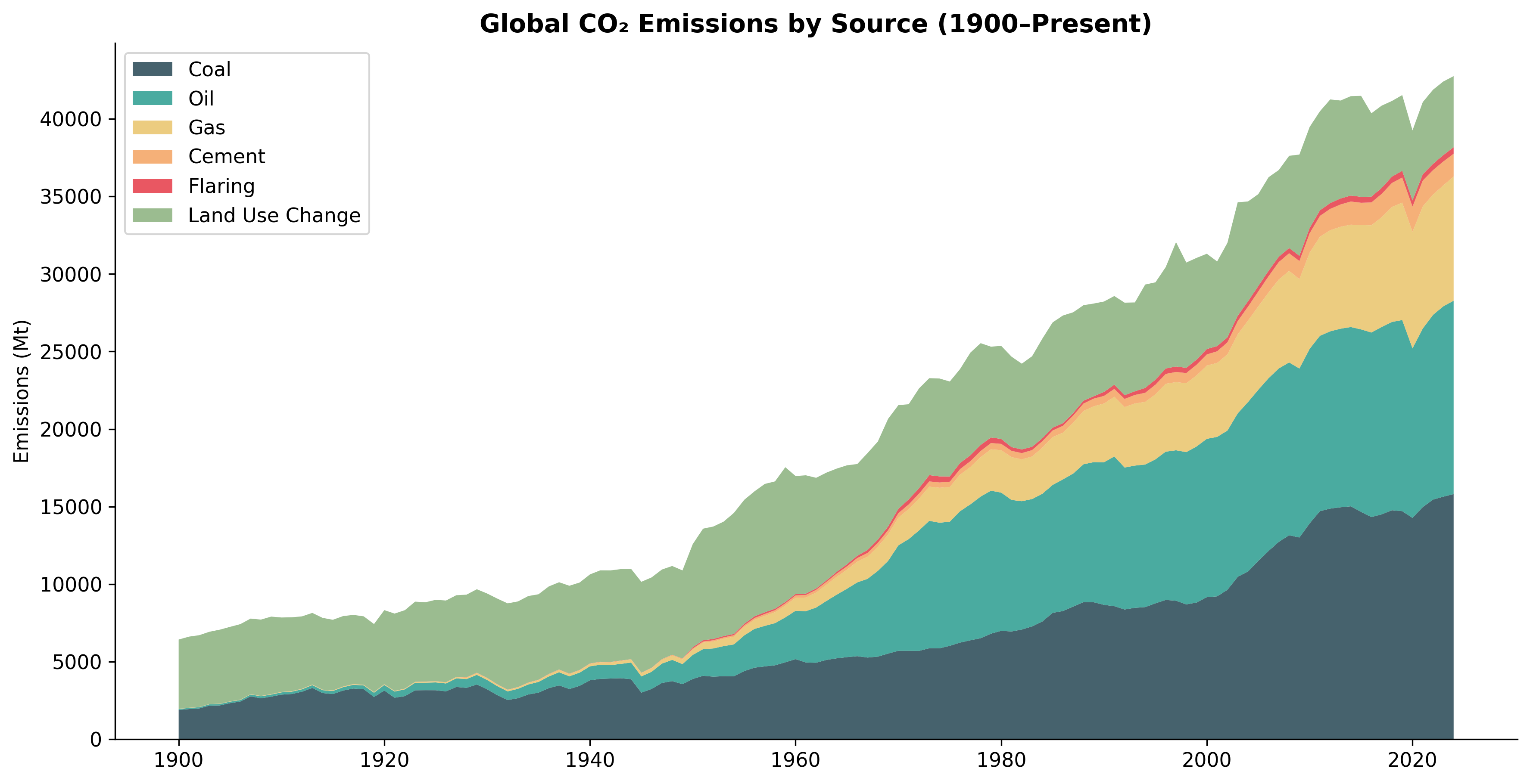
To understand the drivers of global CO₂, we can look at the composition of sources out of total global emissions over time.

Emissions by Source

Historically, Land Use Change and Coal were the primary drivers. Over the 20th century, Oil and Gas increased structurally as transportation and broader energy-needs exploded.

Code for Emissions by Source

View Code
world_df_plot = df[(df["country"] == "World") & (df["year"] >= 1900)]
sources = ["coal_co2", "oil_co2", "gas_co2", "cement_co2", "flaring_co2", "land_use_change_co2"]
labels = ["Coal", "Oil", "Gas", "Cement", "Flaring", "Land Use Change"]
colors = ["#264653", "#2A9D8F", "#E9C46A", "#F4A261", "#E63946", "#8AB17D"]

fig, ax = plt.subplots(figsize=(14, 7))
ax.stackplot(world_df_plot["year"], [world_df_plot[src].fillna(0) for src in sources], labels=labels, colors=colors, alpha=0.85)
ax.set_title("Global CO₂ Emissions by Source (1900–Present)")
ax.set_ylabel("Emissions (Mt)")
ax.legend(loc="upper left")
plt.savefig(OUT / "DS7_global_emissions_by_source.png")
plt.close()

8. Top Historical Contributors

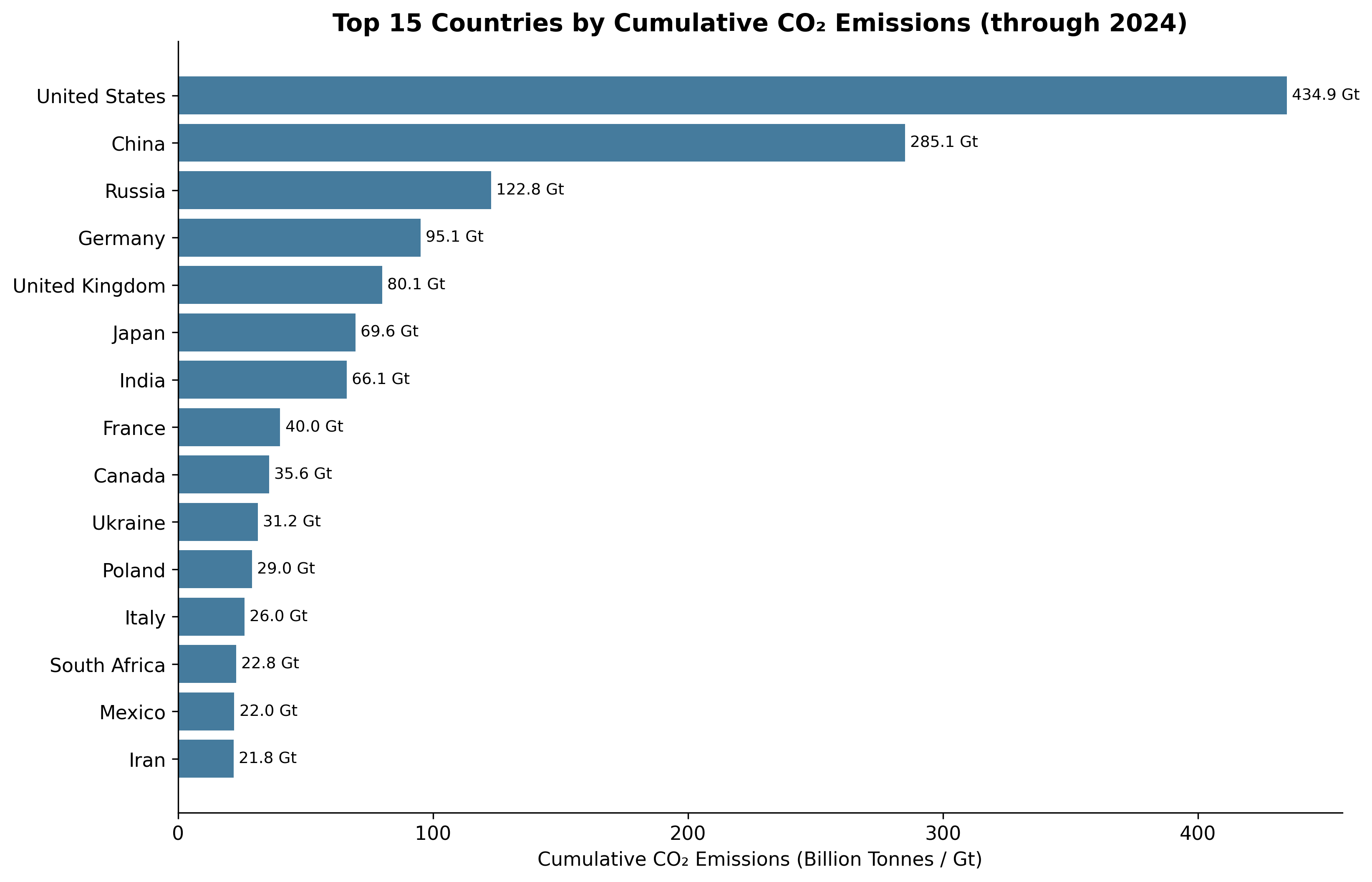
Looking at the entire timeline since 1750, a few nations are responsible for a disproportionate amount of historical emissions relative to the global sum.

Cumulative Emitters

The United States and China are vastly ahead of the rest of the world, having each contributed hundreds of billions of tonnes to atmospheric CO₂ cumulatively over history.

Code for Cumulative Emitters

View Code
country_df = df[df["iso_code"].notna() & (df["iso_code"] != "")]
latest = country_df["year"].max()
top_15 = country_df[country_df["year"] == latest].nlargest(15, "cumulative_co2")

fig, ax = plt.subplots(figsize=(12, 8))
bars = ax.barh(top_15["country"][::-1], top_15["cumulative_co2"][::-1] / 1000, color="#457B9D")
ax.set_title(f"Top 15 Countries by Cumulative CO₂ Emissions (through {latest})")
ax.set_xlabel("Cumulative CO₂ Emissions (Billion Tonnes / Gt)")
for bar in bars:
    ax.text(bar.get_width() + 2, bar.get_y() + bar.get_height()/2, f'{bar.get_width():.1f} Gt', va='center', fontsize=9)
plt.savefig(OUT / "DS8_cumulative_emitters.png")
plt.close()

9. Summary Statistics

Metric Value
Total rows 50,411
Total columns 80
Countries/territories 218
Year range 1750–2024
Global CO₂ (latest year) ~38,000 Mt
Median country CO₂ per capita ~3.5 tonnes
Top emitter (absolute) China (~12,000 Mt)
Top emitter (per capita) Qatar / Gulf states (~30+ t)
Lowest emitters (per capita) Sub-Saharan Africa (<0.5 t)

Plots generated by data_summary_plots.py and data_summary_plots_extra.py. Data source: Our World in Data (OWID) CO₂ and Greenhouse Gas Emissions dataset, Global Carbon Budget (2025).